Printed glass splashbacks: how printing on glass really works
A printed splashback is an image laid on the rear face of the pane and sealed behind it. Whether it looks good has less to do with the printer than with the artwork and where the panel ends up.
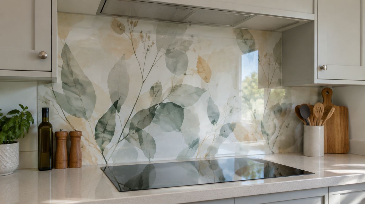
How an image gets onto a printed glass splashback
Printed glass splashbacks are made back to front. The artwork is mirrored and printed onto the rear face of a pane that has already been cut, processed and toughened, using a flatbed digital printer and UV cured ink. Printing happens after the furnace because nothing survives 620°C, and because a toughened pane can no longer be cut, every dimension and cut-out is already fixed by the time the ink goes down.
Behind the image goes a flood coat, usually white, sometimes a colour chosen to suit the artwork. Without it a printed panel is semi-transparent and the wall behind reads through the image, which turns a clean graphic into something muddy and uneven. That backing layer is also why a printed splashback cannot be backlit in any useful way, a question we are asked more often than you would think.
Ceramic ink, fired into the surface of the glass, is a different process used for façade and external glazing where the print face is exposed to weather. For a kitchen splashback the ink sits on the back of the pane with six millimetres of glass in front of it, so it is protected by the glass itself and UV cured ink on the rear face is the normal, appropriate specification. Nothing you do to the front of the panel touches the image.
Printed or back-painted: which one your kitchen actually needs
If your design is a single flat colour, you do not want a printed panel. Back-painting is the right process for solid colour, it gives a deeper and more even result, and it costs less. Some suppliers will quote a flat colour as a digital print because the machine is already running, and the difference is invisible on a quotation. Ask which process your panel is getting and why, and do not pay print rates for one colour.
Print earns its money on anything paint cannot do: a graduated colour that shifts along a run, a pattern repeat, a material texture such as concrete, terrazzo, brass or linen, a graphic, a logo in a commercial fit-out, or a photograph where the resolution genuinely supports the size.
There is a middle option people forget. A printed panel in one position, usually behind the hob, with the rest of the run back-painted in a colour drawn out of the image. It is cheaper than printing a whole kitchen, it puts the detail where you actually look, and it ages better than a continuous image across three metres of wall. Back-painted colour is covered properly on our coloured glass splashbacks page.
What reproduces well behind glass, and what does not
Things that work: high contrast graphics, abstract and textural images, single tone patterns, soft gradients, large simple shapes, and anything whose appeal does not depend on fine detail. Glass flatters all of these, because the gloss front face adds depth and the image appears to float slightly below the surface.
Things that fight you: small text, fine line work, faces and skin tones, intricate repeating detail, and very dark photographs. The dark image problem is the one nobody warns you about. A gloss panel is a mirror as well as a picture, so a dark image behind a well lit kitchen shows you a dim version of your own room with the photograph somewhere underneath it. Lighter, flatter, higher contrast artwork holds its own against that reflection. Dark scenes lose every time.
Scale behaves in ways people do not expect. A small detail enlarged to three metres often becomes an abstraction, and abstractions make excellent splashbacks. A whole landscape shrunk into a 600mm panel behind a hob becomes visual noise competing with your pans, your hood and your kettle. If you are choosing an image on a screen, crop it to the panel proportions first and look at that crop rather than the full picture.
One practical point about cut-outs. A socket cut-out in the middle of an image is a hole in that image, and where it lands is a design decision. We put the cutting drawing and the artwork on one sheet before printing so you can see a faceplate sitting in the middle of a pattern before it is permanent, rather than afterwards.
Resolution, and the arithmetic of a three metre panel
The number that matters is resolution at the final printed size, not megapixels. As a working rule, an image viewed from arm’s length on a wall wants somewhere around 100 to 150 dots per inch at full size, and below that detail starts to soften into mush.
So run the sum before you fall in love with a file. A panel 3000mm long and 600mm high is about 118 inches by 24 inches. At 150dpi that needs an image of roughly 17,700 by 3,500 pixels, which is around 60 megapixels. A photograph straight off a phone is typically 4,000 pixels along its long edge, which stretched over 3000mm gives you about 34dpi. Enlarge it and you will see the pixels from the other side of the kitchen.
That does not rule out your own photograph, it just means the subject has to forgive the softness. Texture, sky, water, foliage and out of focus backgrounds survive enlargement. Architecture, lettering, crowds and anything with a hard repeated edge do not. Where a file is marginal, modern upscaling can help with textural work, but it cannot invent detail that was never recorded, and it makes a mess of straight lines and text.
If you are buying from a stock library, buy the largest file size offered rather than the one that looks big enough on screen, and check the licence actually covers reproduction at that size. For a shop, café or salon, that often means an extended licence. The file formats and colour profiles we accept are listed on our main splashbacks pages; what matters here is whether the image can survive the enlargement at all.
Proofing: what to approve, and what a proof cannot tell you
A digital proof is a layout document. It shows you the crop, the orientation, the scale of the image against the panel, where the joints in a multi-panel run fall, and where every cut-out lands relative to the artwork. Those are the things to check carefully, because they are the things that are impossible to live with if they are wrong.
What a screen proof cannot tell you is colour. Your monitor emits light and is calibrated to nothing in particular; a finished panel reflects light, is viewed through glass with its own faint tint, and sits under your kitchen lighting. For colour critical work, and especially for brand colours in a commercial job, ask for a printed sample on the same glass with the same backing coat, and look at it on the wall it is going on. A screen is not a colour contract and no reputable supplier will pretend otherwise.
Once a panel is printed and cured it is finished. It cannot be reprinted, washed off, trimmed or drilled. That is why we hold an order at proof stage until it is signed off, and why we would rather chase you for an approval than make something you did not quite mean.
Where printed glass splashbacks look dated, and where they earn their place
The photographic mural splashback had its decade and it shows. Poppy fields, Manhattan skylines at night, a single red chilli on a white background: these are visibly of a period, and in a flat you might sell in a few years they are the one element a buyer will mentally price as a replacement. We will say that out loud before taking the order, because the alternative is you paying twice.
What lasts is artwork that behaves like a surface rather than a picture. A muted gradient. A texture that reads as stone, plaster or metal. A pattern drawn from something already in the room, at a scale that does not shout. Tone on tone graphics. In five years those read as a material choice; a photograph reads as a date stamp.
If you want to take a risk, take it where it costs less and matters less. A utility room, a cloakroom, a coffee station, a back wall away from the main run. The glass behind a hob is the hardest working and most looked at surface in a kitchen, and it is the wrong place for an image chosen in an afternoon.
Commercial work is where print stops being decoration and starts doing a job. A logo behind a counter, a brand colour matched across a servery, a menu board that wipes clean, a pattern across a salon station wall. Paint cannot do any of that, and in those jobs printed glass is not an indulgence, it is the specification.
What printed glass will not do
It will not glow: the opaque backing that makes the image read properly also stops light passing through. It will not be matt unless the front face is etched, and etching softens fine detail, so a highly detailed image and a matt finish pull against each other. It cannot be altered, extended or trimmed after curing. And like any toughened panel it cannot be drilled, so every hole and cut-out has to be decided before the glass is made.
FAQ
Questions about printed glass splashbacks
Can you print a photo on a glass splashback?
Yes, if the file is big enough and the subject forgives enlargement. Aim for around 100 to 150dpi at the finished size, which for a panel three metres long means an image of roughly 17,000 pixels across, far more than a phone camera produces. Textural subjects, skies, water, foliage and soft backgrounds enlarge well. Architecture, lettering, faces and fine repeated detail do not, and very dark photographs get washed out by the reflections in a gloss panel. Send us the file before you commit and we will tell you honestly how it will look at size.
Do printed glass splashbacks fade over time?
In normal use they do not. The ink is printed on the rear face and then sealed behind a backing coat, so the image is protected by the glass in front of it and by the coating behind it, and it is UV cured rather than air dried. The circumstances worth discussing are a panel in long hours of direct sunlight, for example on a south facing wall in a bright extension, where strong single colours have more to lose than muted images. If that describes your kitchen, raise it when you order so the ink and backing can be specified accordingly.
Can you print on low iron glass?
Yes, and it is worth considering when the artwork contains pale tones or has to match a brand colour exactly. Standard clear float glass has a faint green cast in its body, which sits in front of the printed image and very slightly cools and dulls pale areas. Low iron glass removes almost all of it, so whites stay white and light greys stay neutral. For a dark, saturated or high contrast image there is nothing to gain and we would not recommend paying for it. Ask your supplier which glass the price is based on, because it is not always stated.
Get a price for your splashback
Send the rough size and the colour you have in mind. We will template on site across London and confirm the colour on glass before anything is made.